HESA Finance data for 2022-23 has arrived, earlier than originally promised but in line with last year.
If you think back to that academic year, kicking off as it did with very high levels of inflation and proceeding into severe geopolitical uncertainty, you can see the roots of much that universities are dealing with now. This is lagged data, obviously, but it fundamentally underpins much of what the Office for Students has warned us about the next few cycles.
There’s obviously a pile of data released within the finance collection – it offers an unparalleled public overview of the state of most providers in a comparable way based on independently audited data. I say “most” as some providers have not managed to make a submission this year – data from the following provider is not shown:
- Bloomsbury Institute Limited
- University of Northampton
- The University of Kent
- University of Chester
- Higher Rhythm Limited
- Numerica Risk Management and Consulting Ltd
- The University of the West of Scotland
- Heriot-Watt University
In a modern diverse sector, not all providers use the same financial year. This release is the major one and includes new data from traditional providers with financial years ending alongside academic years – other newer providers have data released at other parts of the year.
KFIs
Our first port of call is HESA’s Key Financial Indicators. These are a set of standardised indicators that offer our clearest view of the financial position of the sector as the 2022-23 academic year came to an end.
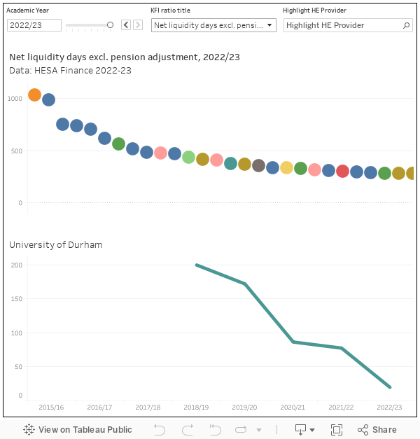
Net liquidity days represents the notional amount of time a provider could continue to operate if all income was to cease. As a rule of thumb, anything below 30 days for a larger provider (smaller providers may have alternative financial management approaches) is a matter for further investigation – you can see some very large and well-known universities below that level on this measure that excludes the actuarial gains and losses from pension adjustments.
Do also take a look at the external borrowing as a percentage of total income measure (many larger universities are significantly leveraged), and the debt service ratio (the ratio of net operating cash flow to debt service costs) that demonstrates the cost of borrowing against income in a particular provider context.
Overall position
HESA data allows us to disaggregate provider income and expenditure in numerous ways. Perhaps the best known is the top level consolidated statement of comprehensive income and expenditure, which I present (in what I hope is an easy to read format) for each provider here.
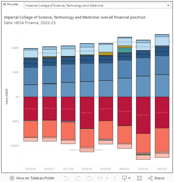
This shows top level categories – staff costs and other operating expenses as negative, fees and grants as positive. A glance at a more established provider is a handy reminder of the sheer scale of operations for a modern university. Our providers may be world class seats of scholarship and research, but they are also (by any standards) very large businesses.
One of the points of greatest annual interest from this dataset is the surplus (or deficit). My simple visualisation here demonstrates the variety within the sector – the comfortable position of some providers alongside the more concerning financials of ostensibly quite similar places.
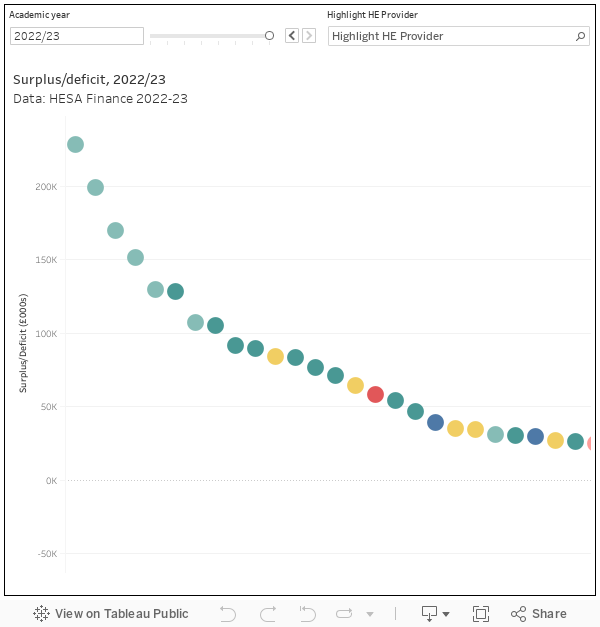
This is the reason why whole sector or grouped provider data simply doesn’t ring true. There is nothing about a strategic focus or mission group membership that offers us clues to how things might sit on the balance sheet. We cannot, and should not, generalise about “good” providers succeeding and “poor” ones floundering.
Fee income
The dwindling real terms value of home undergraduate income, coupled with the volatility of the international market and changes in home postgraduate taught recruitment, represents one of the (many) major concerns currently faced by universities and colleges. HESA data allows us to see under the bonnet at a provider level.
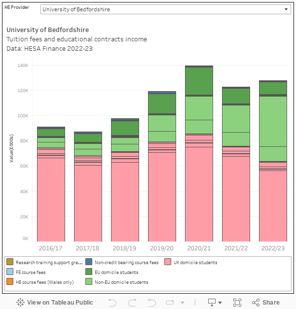
For me, the story visible here is one of volatility. It is within living memory that providers could plan for the future safely within an income tolerance band, and that expansion happened alongside investment in facilities. Those days are gone and are unlikely to return in the short term, meaning that each year providers need to deal with substantial swings in student demand, income, and resource requirements.
The increasing reliance on many providers on international students, and the way that international students now dominate many graduate schools, should also give us pause here.
Spending it
The income data from HESA is commendably detailed, but the expenditure detail offers a perspective on the costs associated with quite small areas of an institution. This visualisation allows you to look at individual cost centres within a given university, and see the contribution of academic staff, and other staff, costs to expenditure in that area.
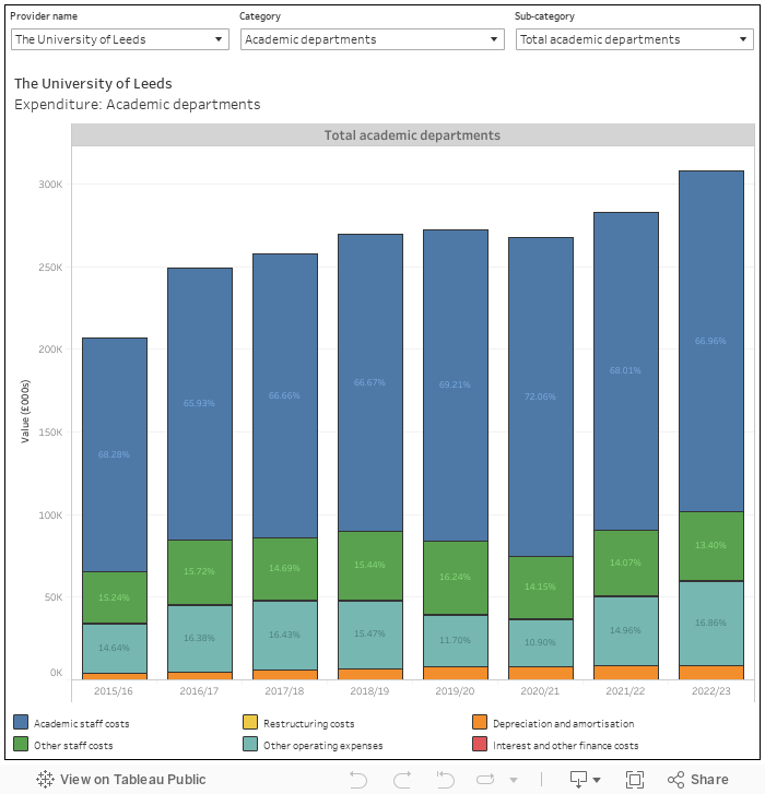
There’s so much in there that will be of interest at departmental level (although, of course, cost centres do not map cleanly to departments). It also allows us to address one frequently heard canard – that providers are spending more on central services than on academic departments. This is not the case.
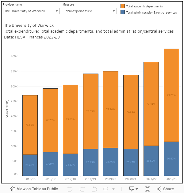
In total, spending on non-academic cost centres sits at about a third of total expenditure – there’s a slight year on year growth but academic cost centres still see the lions share of university funding. Again, the position is variable at provider level, where the whole “post-92, more central services” rule no longer holds.
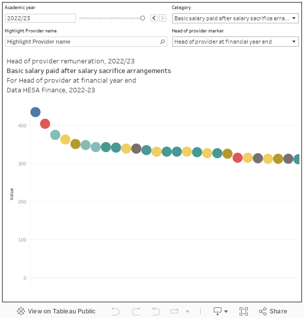
While we are addressing canards, it is worth having a look at head of provider pay. While it looks hefty compared your (or my) pay packet, docking your vice chancellor’s pay wouldn’t do much for your overall financial position.