
Effective visual representations can help higher education bridge silos and unleash the power of data.
Data is everywhere, and organizations in numerous industries are using 21st-century analytics to gain insight into their operations, discover and understand trends, and develop predictions. The use of "big data"—a grand scale of data and access to such over multiple platforms and data sources—in higher education is not as well established as in other industries such as business or media, and higher education tends to have decentralized structures in which each division, such as academic affairs or institutional research, works in a silo, making an institution-wide approach to data dissemination challenging.Footnote1 Still, higher education leaders recognize the significance, opportunities, and challenges that come with institution-wide data analytics, and colleges and universities have begun to use big data for decision-making. With the efforts of skillful information workers such as data analysts, business intelligence developers, and data scientists, higher education is becoming a place where data hoarding may become a thing of the past and where information will be more transparent and democratic in the sense that opportunities to access data will become equal for everyone. Concepts such as machine learning, bottom-up data democratization, ephemerality versus permanence, and team accountability are breaking the old paradigm in which top management controls and owns information resources.Footnote2 In activities ranging from student success to institutional finances, data analytics in higher education is helping institutions identify problems, opportunities, and areas for improvement.
Today, data analytics calls for a model in which information workers take on the roles of the experts and consultants, while managers act as facilitators by investing in human resources and technologies to compile, analyze, and represent data in a form that speaks to the audience, evokes credibility, and provides easy-to-read and understandable context and content. This is where data visualization steps in.
What Is Information Visualization?
Charts are a big part of our lives today, from weather forecasts to stock charts to sleep trends on smart watches. Charts and graphs are the basic components of data visualization, which is a method for using data, whether quantitative or qualitative, to create diagrams that communicate a message, enabling humans to interpret data and use it to make decisions.
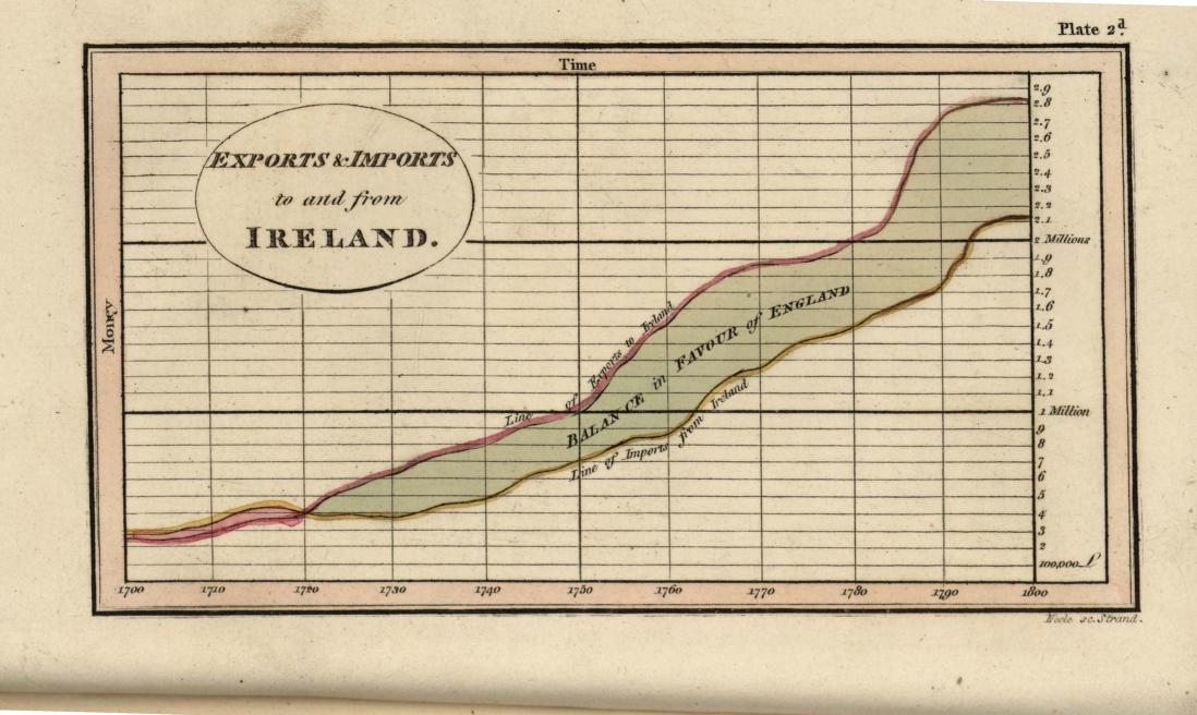
The visualization of information using graphs and charts to depict statistical data has been around since at least 1786, when Scottish engineer William Playfair created a set of charts illustrating British trade and debt (see figure 1).Footnote3 This was the first known attempt to visualize static data on paper and marked the beginning of a new way to communicate information.
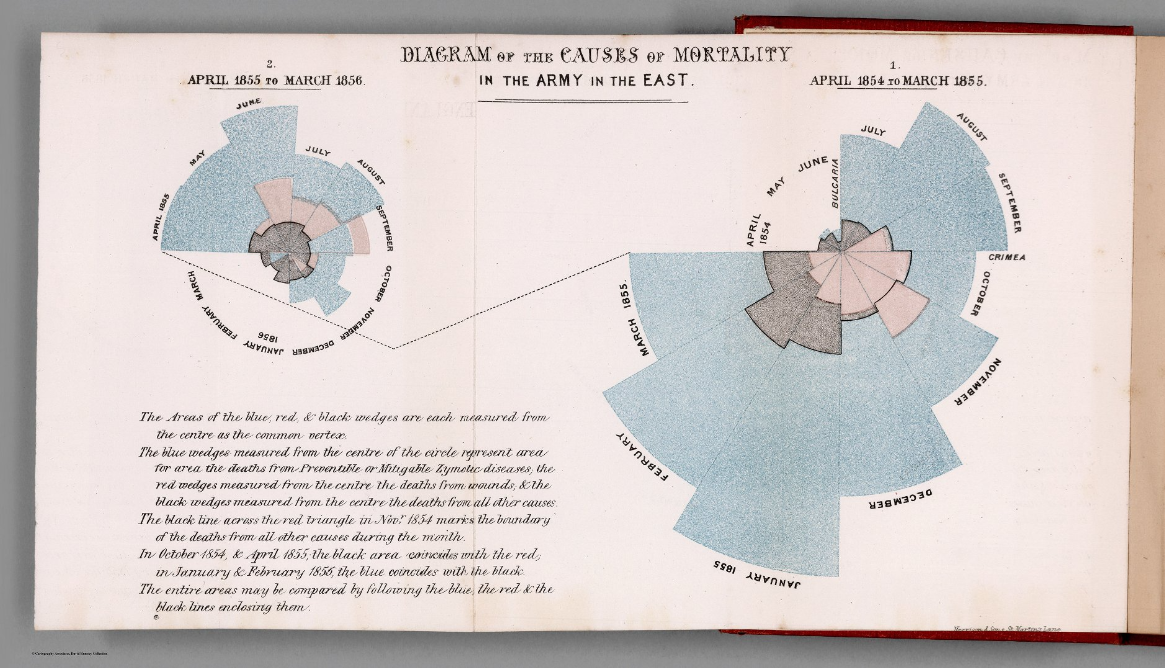
Another significant figure in the history of data visualization is Florence Nightingale. The founder of modern nursing, Nightingale had a knack for mathematics, which helped her pioneer graphical representations of statistics. She is the inventor of the polar area or "Coxcomb" chart, having first used it to represent the causes of mortality in the army (see figure 2).Footnote4
From bar graphs to lollipop charts to maps to Sankey charts, numerous methods of depicting data have been invented, as have the technologies that aid in the creation of charts. Common practices have been established, the best of which have been designed by some of the field's most dedicated, creative, and knowledgeable leaders. Modern-day influencers such as Alberto Cairo, Andy Kirk, Cole Nussbaumer Knaflic, and Giorgia Lupi contribute almost daily to help data visualization practitioners discover, develop, and grow on their data journeys, no matter what those may be.Footnote5
What Makes a Great Visualization?
From among the numerous resources that describe what makes a good visualization, the following seven elements show up in almost all recommendations, serving as a reference for how to present information that can be processed quickly and easily.
1. Understanding the Audience
Just as for every great presentation the audience must be at the forefront and drive the content, so too for every great visualization data people need to reach out to and capture the right audience. Sometimes that audience won't come from a single department or age group. How does one account for such variability? The answer is to not always follow a generic "capture all" approach. If the data visualization is presented in a single manner in an attempt to answer everyone's questions, then it will most likely fail.
When considering the audience, certain questions will serve the developer well in deciding on the best approach. For instance, what is the audience's numeracy level or familiarity with a data visualization? Does the audience understand what a distribution coefficient is? Is the audience a crowd of statisticians or a group of history faculty? What college deans need to see is most likely very different from what a program coordinator needs to work with. Hence, the visualization should be designed to deliver the information at different levels of aggregation and/or detail. For example, a dean might be interested in knowing the overall retention trends for undergraduates across years, while the program coordinator might want to view that data grouped by major and/or be able to drill down to the student level. Ultimately, what should drive the visualization are the needs of the audience. It is prudent to consider accommodating for the variety of audiences interested in the data and the level of detail they need to see or should see.
2. Understanding the Problem
Before a visualization can be built, a complete understanding of the problem or the question that needs to be answered must be achieved. This is what is known as the interview stage. The report developer/designer needs to fathom the essential point of the visualization(s) first by outlining the scope of the project and the key points that need to be addressed. It is imperative that the developer work closely with the person(s) asking for the data to clearly outline all requirements and help the requestor discover elements in the data that could be useful or that may need to be omitted if they do not aid in meeting the objective. Most importantly, the developer should ensure that the data answers the question, and this often means returning frequently to the original issue that the data visualization will seek to answer. In the end, when the visualization is delivered, the audience must be able to make a connection between the data represented and the problem that this visualization is meant to solve.
3. Clarity
For a data visualization to be successful it must present true and valid data clearly and simply. For a visualization to be clear it must be readable, transparent, and designed without extraneous bits that could result in a misreading of the data. Every data visualization involves decisions about which data to include and which to leave out, and developers increase their credibility and help readers by providing explanations, when appropriate, for why those decisions were made.
Richard Saul Wurman identified himself an architect of information, "as in the creating of systemic, structural, and orderly principles to make something work—the thoughtful making of either artifact, or idea, or policy that informs because it is clear."Footnote6 Creating clear and straightforward graphics also comes with solid design that is functional and elegant and offers an instant picture about the story that is being told. If done right, a visualization helps the audience interpret the information in the way that the developer intended.
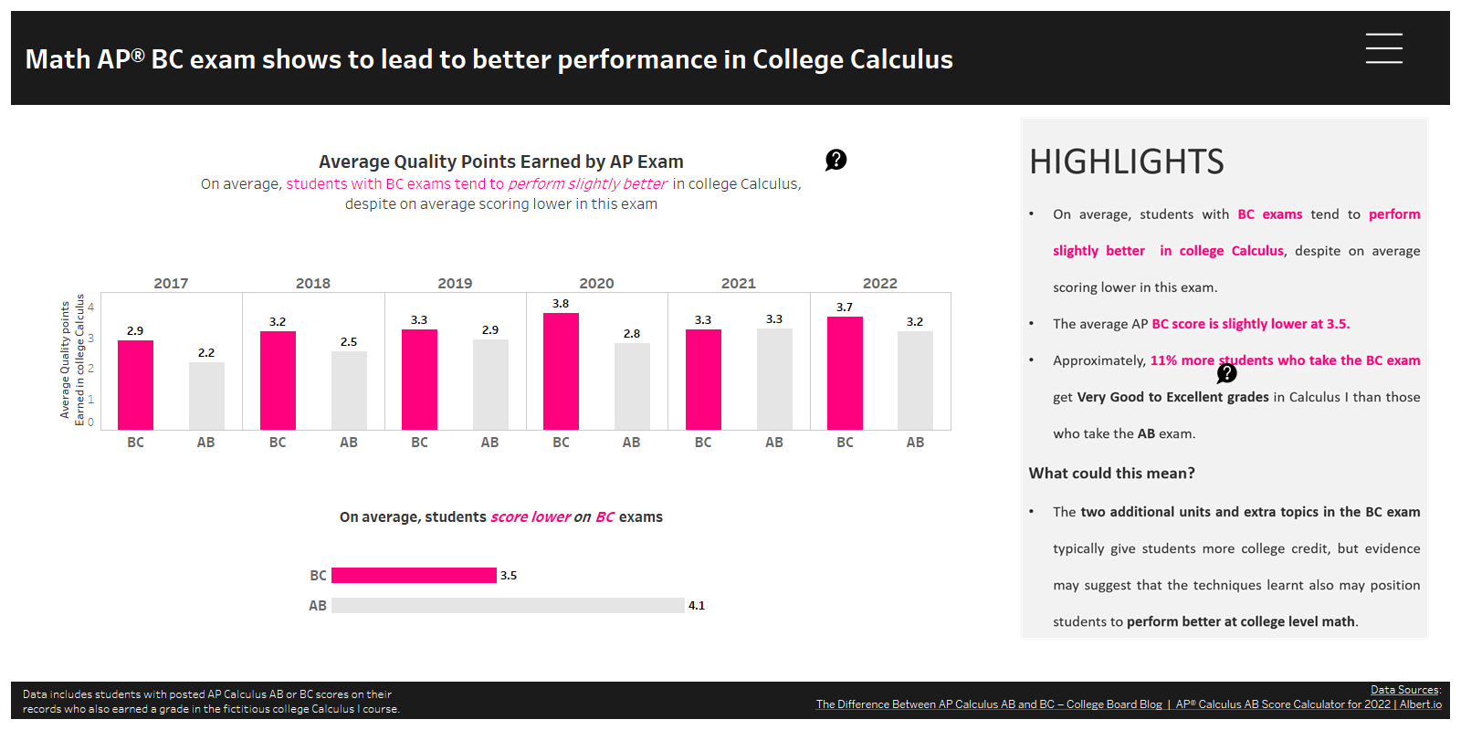
The chart in figure 3 illustrates the relationship between student performance in college calculus and on the Advanced Placement calculus test. The intent of the dashboard is clearly defined in the main title, and further clarity is provided through additional content in the Highlights section on the right. Furthermore, the online version of this graphic is interactive, allowing users to hover over the graphs and question marks to view more details, as well as click on the main menu (hamburger icon) in the top right corner to read more about AP calculus. Users can also filter the data by year.
4. Usefulness
A data visualization is different from graphics such as illustrations or photos because it uses data sets to visually display information. Some visualizations are interactive, allowing users to make their own discoveries by exploring and dissecting the information. Data visualization allows viewing and understanding trends, highlighting important statistics, and making predictions. For a data visualization to be useful, it must do one or more of the following:
- Identify trends.
- Highlight the important factors.
- Provide insights.
- Help the user identify areas for improvement.
- Help the user identify patterns or correlations.
- Provide useful interaction.
- Help the user predict trends or behaviors.
- Communicate an important story.
How useful do you find the previous figure about student performance in College Calculus and Advanced Placement Math Calculus? Does it provide a clear story about student performance in the course based on their performance on the AP exam? Would it entice you to look into evaluating the requirements for college calculus? If the answer to one or more of these questions is "yes" then more data would probably be needed to explore further.
5. Insightfulness
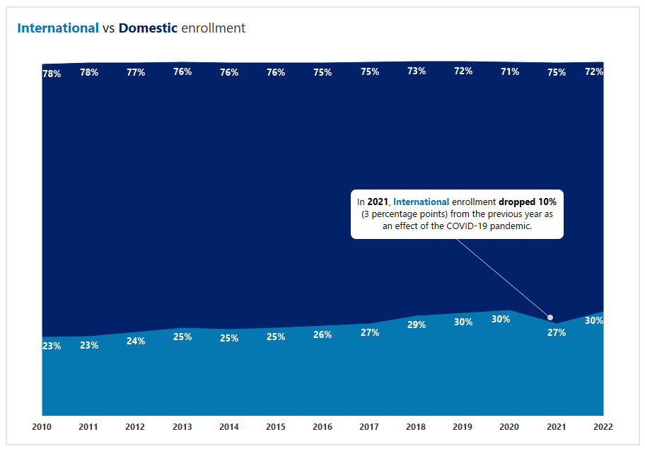
The purpose of any data visualization is to offer understanding of a topic or question. According to UX Planet, "Insights are patterns in the observations we make in the world. They give us an understanding of a specific cause and effect within a specific context. They help us explain our observations."Footnote7 It is that "Aha!" moment. Insights are helpful in solving problems because they offer different ways of viewing things or reframing the problem (see figure 4).
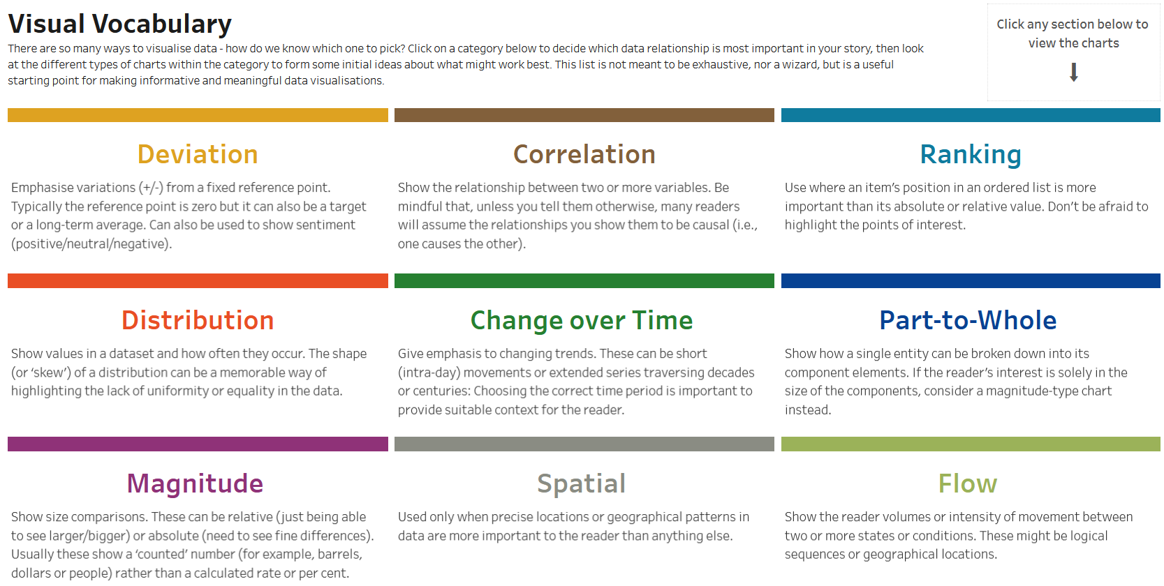
6. Design
Use a visual that shows the intended audience the information in the simplest form possible. One of the biggest challenges is deciding which visual should be used to convey information. Plenty of helpful materials are available that have been put together by leaders and influences in the area of analytics. For example, Andy Kriebel offers an appealing visual vocabulary, as shown in figure 5. Kriebel presents the most effective visualizations, according to his recommendations, by topic. This is a non-exhaustive list but does offer a strong point of reference for individuals who want to know about the different ways to visualize data.
What does this have to do with design? A lot. Selecting which chart type to use is a choice regarding both function and design. The function aspect pertains to how a user navigates the various sections of the visualization. The design part affects the way the audience perceives and interprets the data. It could mean the difference between capturing the audience's attention or losing them completely because the layout is muddled. Consider the visual hierarchy, which is the way that the different elements of a visualization, such as a dashboard (a way of conveying similar or different pieces of information in a single place), are organized. An organized layout aids with the understanding and flow of the data and ultimately with the telling of the data story. With hierarchy comes order, and ordering the data in terms of significance is key to presenting the information in the way that was intended.
7. Story
What is in a story—a data story, that is? According to a post about Microsoft Power BI, data storytelling "is the concept of building a compelling narrative based on complex data and analytics that help support the message of your story to influence and inform."Footnote8 In the realm of higher education in particular, professionals tell stories about enrollment, retention rates, graduation rates, academic performance, career indicators, and rankings, to name a few of the most prominent. How are data stories different from simply displaying data in spreadsheets or on isolated dashboards? Stories help answer the question of why something is happening, not just what is happening. Business intelligence tools such as Power BI or Tableau aid in that process. They are the tools to the means that eventually create a story both effectively and insightfully. Data storytelling can be powerful. The narrative provides context and drives insights. Jon Boeckenstedt, blogger and vice provost of enrollment at Oregon State University, has compiled numerous articles around data storytelling with a focus on higher education.Footnote9 In his November 12, 2021 blog, he illustrates three ways of looking at graduation rates.Footnote10 His narrative encapsulates the six-year graduation rates of traditional, doctoral, master, and baccalaureate colleges and universities. Before showing the data visualization, Boeckenstedt makes a point to diligently describe the data set used and methodology followed. His story is structured to entice the audience to think about graduation rates in three ways: by need, by ethnicity, and by chances.
Conclusion
Understanding how to read visualizations like bar charts or maps is important, perhaps even critical, in higher education. According to Alberto Cairo, "Good data visualizations communicate information and, as a result, they can increase our understanding."Footnote11 Good visualizations can also prompt users to indulge their inner explorers, leading them to ask more questions about data. Because any information visualization must compete with other signals for people's attention, the information must be intuitive, nice to look at, and effortless. The message must be clear, and, most of the time, simplicity beats complexity. Acquiring a solid sense of what data visualization is, as well as understanding basic concepts such as visual encoding and decoding, helps both the data visualizer and the reader. For visualizations to be great, practitioners must gain a solid understanding of the audience and the problem and aim for a clear, useful, insightful data analysis and visualization. An organized design—particularly one that provides context—will ultimately help the audience understand the intended data story. A great visualization is simple to read and may often lead to more questions!
Notes
- Chris Dede, Andrew Ho, and Piotr Mitros, "Big Data Analysis in Higher Education: Promises and Pitfalls," EDUCAUSE Review, August 22, 2016; Jamie Hunt, "Death to Silos," Inside Higher Ed, March 18, 2021. Jump back to footnote 1 in the text.
- Vince Kellen, "21st-Century Analytics: New Technologies and New Rules," EDUCAUSE Review, May 20, 2019. Jump back to footnote 2 in the text.
- Thomas Gonzalez, "Mobile Data Visualization Design," Medium, July 7, 2019; "William Playfair Founds Statistical Graphics, and Invents the Line Chart and Bar Chart," Jeremy Norman's HistoryofInformation.com (website), accessed January 17, 2023. Edward Tufte, the renowned U.S. statistician, professor emeritus, and expert in data visualization, was the first to bring to light Playfair’s insightful graphical representations of statistical data. See Edward R. Tufte, The Visual Display of Quantitative Information, 2nd ed. (Cheshire, CT: Graphics Press, 2001). Jump back to footnote 3 in the text.
- Richard Farnworth, "A Short History of Data Visualisation," Towards Data Science, July 2, 2020. Jump back to footnote 4 in the text.
- See the Twitter accounts for Alberto Cairo, Andy Kirk, Cole Nussbaumer Knaflic, and Giorgia Lupi. Jump back to footnote 5 in the text.
- Richard Saul Wurman, Information Architects (Amsterdam: Amsterdam University Press, 1996). Jump back to footnote 6 in the text.
- Arnav Kumar, "What Are Insights?" UX Planet, November 18, 2019. Jump back to footnote 7 in the text.
- "What Is Data Storytelling?" Microsoft, n.d., accessed September 27, 2022. Jump back to footnote 8 in the text.
- Jon Boeckenstedt, "What This Blog Is About," Higher Ed Data Stories, n.d., accessed September 27, 2022. Jump back to footnote 9 in the text.
- Jon Boeckenstedt, "Three Ways of Looking at Graduation Rates, 2020," Higher Ed Data Stories, November 12, 2021. Jump back to footnote 10 in the text.
- Alberto Cairo, The Truthful Art: Data, Charts, and Maps for Communication (Voices That Matter) (1st ed.) (Westlake Village, CA: New Riders Publishing, 2016). Jump back to footnote 11 in the text.
Anna Kourouniotis is a senior Database Analyst at Duke University.
© 2023 Anna Kourouniotis. The text of this work is licensed under a Creative Commons BY 4.0 International License.