
Undergraduate institutions of doctoral recipients

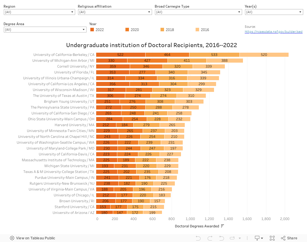
This post is popular every year, and I've just updated it with the most recent NSF data (you can find the link to create your own tables on the visualization if you want.)

It shows the undergraduate college of people who received doctorates in 2016, 2018, 2020, and 2022.  As you can see from the top-level view, UC Berkeley produces more graduates who go onto a doctorate than any other institution in the US. 

But maybe that's not what you need: You might be working with one of those special high school students who already knows they want to get a doctorate, or you might want to show which college from a group of peers sends the most people to a Ph.D. or Ed.D.  Or you might want bragging rights against your alma mater's bitter academic rival. This visualization, of course is interactive.

So use the controls at top to find colleges by region, by religious affiliation, or by broad Carnegie type.  And filter further to find, for instance, the liberal arts college in the Great Lakes states that sends the most students to Ph.Ds in Chemistry (Hope College).  Or, the institution in the Middle Atlantic states sending the most students to a doctorate in History (Columbia.)

One answer to that question you're wondering about: No, I cannot normalize this to show the percentage of graduates of any institution who go on to get a doctorate, because I'd have to guess about when the people in 2018, for instance, graduated from college.  For some, it could be 2014; for others, 2000.  If you want to take a stab at doing it, be my guest.

I always love to hear when people are surprised by what they find in these visualizations.  Let me know what you find.


Comments

Popular posts from this blog

The Highly Rejective Colleges

If you're not following Akil Bello on Twitter, you should be.  His timeline is filled with great insights about standardized testing, and he takes great effort to point out racism (both subtle and not-so-subtle) in higher education, all while throwing in references to the Knicks and his daughter Enid, making the experience interesting, compelling, and sometimes, fun. Recently, he created the term " highly rejective colleges " as a more apt description for what are otherwise called "highly selective colleges."  As I've said before, a college that admits 15% of applicants really has a rejections office, not an admissions office.  The term appears to have taken off on Twitter, and I hope it will stick. So I took a look at the highly rejectives (really, that's all I'm going to call them from now on) and found some interesting patterns in the data. Take a look:  The 1,132 four-year, private colleges and universities with admissions data in IPEDS are incl

Freshman Migration, 1986 to 2020

(Note: I discovered that in IPEDS, Penn State Main Campus now reports with "The Pennsylvania State University" as one system.  So when you'd look at things over time, Penn State would have data until 2018, and then The Penn....etc would show up in 2020.  I found out Penn State main campus still reports its own data on the website, so I went there, and edited the IPEDS data by hand.  So if you noticed that error, it should be corrected now, but I'm not sure what I'll do in years going forward.) Freshman migration to and from the states is always a favorite visualization of mine, both because I find it a compelling and interesting topic, and because I had a few breakthroughs with calculated variables the first time I tried to do it. If you're a loyal reader, you know what this shows: The number of freshman and their movement between the states.  And if you're a loyal viewer and you use this for your work in your business, please consider supporting the costs

The College Finder

Note: A few people have commented on slow loading with the visualization.  If you have troubles, click here to be taken right to the visualization .  It should open in a new tab and you can follow along from there.    This is always a popular post with high school counselors, IECs, parents, and students who are looking for general information on degrees awarded, or a very specific combination of academic programs, location, and other institutional characteristics. It uses IPEDS data I downloaded as soon as I can when it became available (and before a looming government shutdown), and shows all 1,700 majors recognized by the federal government in the IPEDS system, using CIP codes, and the number of degrees awarded by college in any selected area. For instance, you might have a question about which college awards the most degrees in French Language and Literature: A few clicks, and you find it's the University of Arizona.  If you want a colder climate, choose the Great Lakes region,