Higher Ed Data Stories

article thumbnail

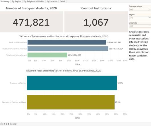
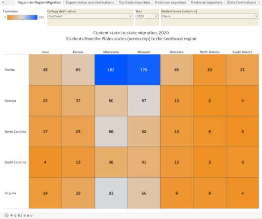
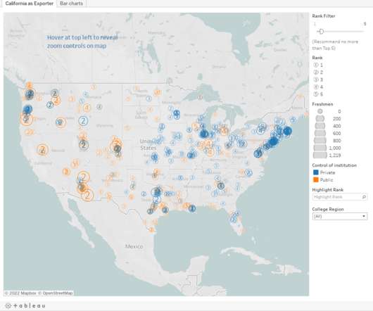
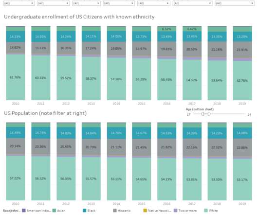
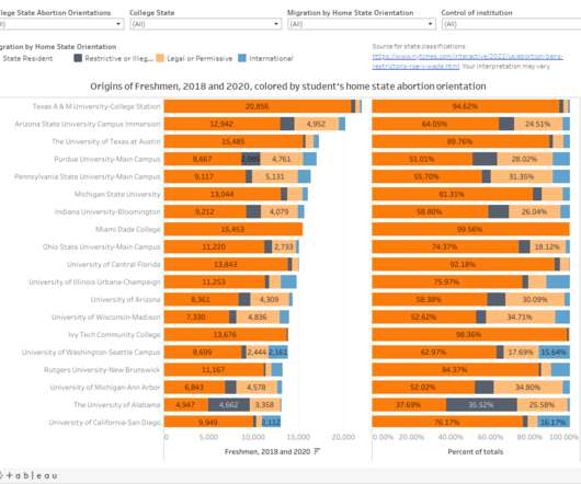
Are students fleeing to the south to avoid The Woke? Three possible answers.

Higher Ed Data Stories

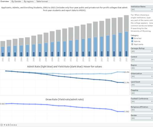
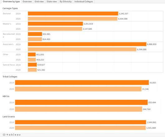
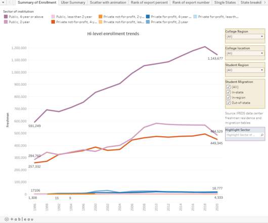
The three answers to the question in the title, in case you want to cut to the chase, are "Yes," "No," and "Maybe but we really can't tell for certain." This has been a point of discussion for some time. The completely neutral publication Southern Living, with absolutely nothing to gain from publishing this piece, for instance, was convinced it was true back in 2022.

Students 273
article thumbnail

Private college discount rates for first-year students, 2021

Higher Ed Data Stories

Before we begin, here is what this post does not do: It will generally not tell you where you can get low tuition, with a very few exceptions. And when it does, it won't be at one of "those" colleges. It will not tell you which colleges are likely to close soon, although after the fact, you can probably find a closed college and say, "Aha! Right where I expected it would be!

College 301
university leaders

Sign Up for our Newsletter

This site is protected by reCAPTCHA and the Google Privacy Policy and Terms of Service apply.

article thumbnail

Changes in SAT Scores after Test-optional

Higher Ed Data Stories

One of the intended consequences of test-optional admission policies at some institutions prior to the COVID-19 pandemic was to raise test scores reported to US News and World Report. It's rare that you would see a proponent of test-optional admission like me admit that, but to deny it would be foolish. Because I worked at DePaul, which was an early adopter of the approach (at least among large universities), I fielded a lot of calls from colleagues who were considering it, some of whom were exp

Provost 191
article thumbnail

The annual graduation rate post

Higher Ed Data Stories

I know I've been barking up the tree of " Graduation Rates are inputs, not outputs " for a long time. And I know no one is listening. So I do this, just to show you (without the dependent variable) just how unsurprising they are. Here are four views of graduation rates at America's four-year public and private, not-for-profit colleges and universities.

College 146
article thumbnail

First-year student diversity in American colleges and universities, 2018-2022

Higher Ed Data Stories

I started this visualization to show how first-year classes at the highly rejective colleges had changed since COVID-19 forced them all to go to a test-optional approach for the Fall of 2021. But it sort of took on a life of its own after that, as big, beefy data sets often do. The original point was to help discount the conventional wisdom, which is propped up by a limited, old study of a small set of colleges that showed test-optional policies didn't affect diversity.

College 211
article thumbnail

Enrollment is complicated, redux

Higher Ed Data Stories

Enrollment, as I like to say, is complicated. But that never stopped anyone from asking a question like, "How does enrollment look?" To help answer, I downloaded IPEDS data of enrollment from 2009 to 2022, breaking it out by full-time and part-time, graduate and undergraduate, and gender, and put it into three different views, below, using the tabs across the top.

article thumbnail

First-year student (freshman) migration, 2022

Higher Ed Data Stories

A new approach to freshman migration, which is always a popular post on Higher Ed Data Stories. If you're a regular reader, you can go right to the visualization and start interacting with it. And I can't stress enough: You need to use the controls and click away to get the most from these visualizations. If you're new, this post focuses on one of the most interesting data elements in IPEDS: The geographic origins of first-year (freshman) students over time.

Students 321